1) Download Datasets
Download play-by-play data in CSV format.
If you open the dataset, you can see there is a whole lot of information. We’ll do some cleaning later to use only what we need!
2) Create a new R studio project
Create a new project, we’ll call it ‘charts’. R will create a folder named charts. Move your data set inside that folder. Then you will see it in the files section of your new project.
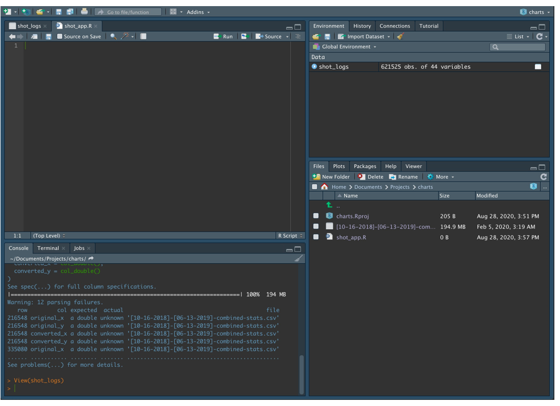
Now click on it and import the data set into R studio. Also, give it an easier name ‘shot_logs’.
Create a new R script ‘shot_app’.
You should have something that looks like this:
3) Install R packages
Let’s install the packages we need and call the libraries.
install.package('tidyverse')
library(tidyverse)
install.package('hexbin')
library('hexbin')
4) Clean Data
Let’s clean our data, it will make life easier later. We need the following columns named:
Team/Player/Result/converted_x/converted_y
Note that “converted_x” and “converted_y” are full-court coordinates. We need to convert them to half-court only.
shot_logs$converted_x<-ifelse(shot_logs$converted_y > 47,50 - shot_logs$converted_x,shot_logs$converted_x)
shot_logs$converted_y <-ifelse(shot_logs$converted_y > 47,94 - shot_logs$converted_y,shot_logs$converted_y)
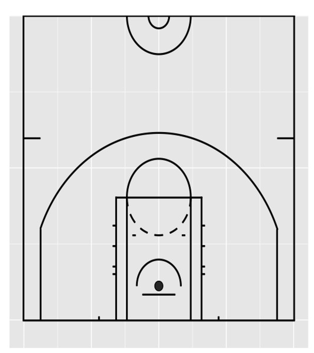
5) Create Court Design
Now that we have the right coordinates, let’s draw the court. The original guide was made by Ewen Gallic and you can find it here.
Our code is a little different, so copy and paste it into R.
Should get something like this
6) Create Function
Right now we could plot the shooting charts of:
1) the entire season
2) a specific team
3) a specific player
The “geom_hex” function lets us divide the court into small bins, and count how many shots were attempted inside that bin. A few things you should know:
binwidth: Choose how big you want your bins
alpha: Transparency, used so we can still see the court behind the bins
count: Select the count intervals you want to display
scale_fill_manual: Decide what colors you want to display
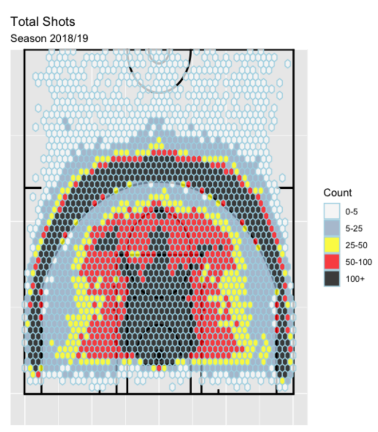
7) Plot the Entire Season
halfP + geom_hex(data = shot_logs,
aes(x =converted_x ,
y =converted_y,
fill = cut(..count.., c(
0,5,25, 50, 100, Inf))),
colour = "lightblue",
binwidth = 1,
alpha = 0.75) +
scale_fill_manual(values = c("grey98", "slategray3", "yellow", "red" , "black"),
labels = c("0-5","5-25","25-50","50-100","100+"), name = "Count")+
labs(title = 'Total Shots',
subtitle = 'Season 2018/19')
8) Plot a Specific Team
First, let’s build a function that will let us choose any team we want.
Then let’s plot the Houston Rockets shooting map. Remember to use ‘HOU’. You can find the other teams
abbreviations in the data set.
generate_team_chart('HOU')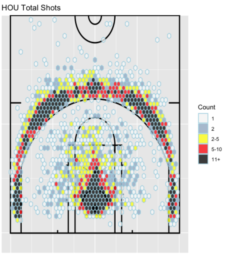
9) Plot a Specific Player
First, let’s build a function that will let us choose any team we want.
And then plot James Harden shots.
generate_player_chart('James Harden')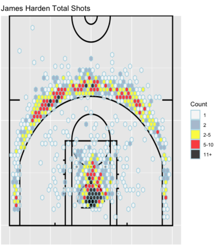
10) Conclusion
I invite the reader to use this guide as inspiration. In addition to shooting maps, you can also create some density curves like the ones on my application!
Also, if you have any questions feel free to contact me or visit my website at www.mattianalytics.com.
11) Bonus: Video
Watch Basketball Shooting Charts with R Studio on YouTube